SHS1 Mathematics · Semester 2, Week 13
Statistical Reasoning and Its Application in Real Life
Full lesson notes coming
Notes for this lesson are being prepared. The curriculum details below are complete and ready to use for your planning.
Curriculum details
- Strand
- Making Sense of and Using Data (Strand 4)
- Sub-strand
- Statistical Reasoning and Its Application in Real Life (4.1)
- Content standard
- 1.4.1.CS.2 - Demonstrate conceptual understanding of data organisation and presentation for grouped and ungrouped data, including 3D graphs/charts with appropriate digital technology. 1.4.1.LO.2 Organise and present data (grouped/ungrouped) using frequency tables, line graphs, pie charts, multiple bar graphs, infographics, etc.; generate 3D graphs/charts with appropriate digital technology (where available) and solve problems on them.
- Indicator
- 1.4.1.LI.2 - Organise and present data (grouped/ungrouped) using frequency tables, line graphs, pie charts, multiple bar graphs, infographics, etc., including generating 3D graphs/charts with appropriate digital technology (where available) and solving problems on them.
- Suggested placement
-
Semester 2, Week 13
(Week 33 of the year)
Our suggestion, laid out in curriculum order across three terms of twelve weeks. NaCCA does not fix the week, so follow your school's scheme of learning.
- Curriculum reference
- NaCCA curriculum document, p. 136
Exemplars (from the NaCCA curriculum)
Using think-pair-share activities, learners are tasked to Organise a given/chosen raw data into a frequency distribution table.
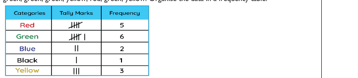
Example 1: Ungrouped data A jar containing beads of different colours- red, green, blue, black, red, green, blue, yellow, red, red, green, green, green, yellow, red, green, yellow. Organise the data in a frequency table.
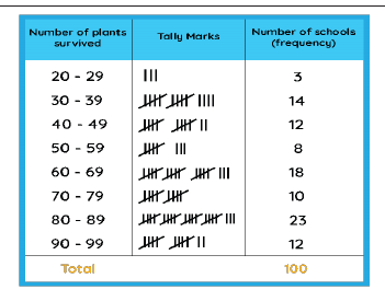
Example 2: Grouped data One hundred schools decided to plant 100 tree saplings in their gardens on World Environment Day. Represent the given data in the form of frequency distribution and find the number of schools that are able to plant 50% of the plants or more. 95, 67, 28, 32, 65, 65, 69, 33, 98, 96, 76, 42, 32, 38, 42, 40, 40, 69, 95, 92, 75, 83, 76, 83, 85, 62, 37, 65, 63, 42, 89, 65, 73, 81, 49, 52, 64, 76, 83, 92, 93, 68, 52, 79, 81, 83, 59, 82, 75, 82, 86, 90, 44, 62, 31, 36, 38, 42, 39, 83, 87, 56, 58, 23, 35, 76, 83, 85, 30, 68, 69, 83, 86, 43, 45, 39, 83, 75, 66, 83, 92, 75, 89, 66, 91, 27, 88, 89, 93, 42, 53, 69, 90, 55, 66, 49, 52, 83, 34, 36.
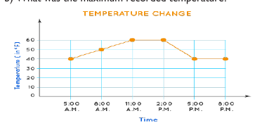
Example 3: Line Graphs The temperature of a city from 5 a.m. to 8 p.m. on a day was recorded in the form of a line graph, as shown below. Study the graph and answer the following questions. a) At which time of the day was the temperature 40° F? b) What was the maximum recorded temperature?
Example 4: Multiple Bar Graphs The chart below is the summary of cases and recoveries of the coronavirus pandemic recorded in various regions in Ghana from March 2020 to 11th August 2022.
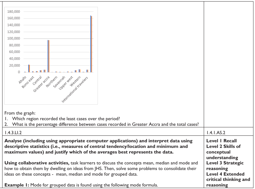
From the graph: 1. Which region recorded the least cases over the period? 2. What is the percentage difference between cases recorded in Greater Accra and the total cases?
Teaching and Learning Resources:
- * Graph sheets * mathematical sets * computer with data organising software like MS Excel, MS
- PowerPoint, etc. * A4, A3 papers * flip charts
- * markers * colour pens, etc. * Reports from analysed data * manila cards
- * worksheets * posters * teaching presentations * enquiry project-template
Assessment (1.4.1.AS.2). The document marks these depth-of-knowledge levels for this indicator: Level 1 Recall; Level 2 Skills of conceptual understanding; Level 3 Strategic reasoning; Level 4 Extended critical thinking and reasoning.