JHS2 Mathematics · Term 3, Week 9
Data
Full lesson notes coming
Notes for this lesson are being prepared. The curriculum details below are complete and ready to use for your planning.
Curriculum details
- Strand
- Handling Data (Strand 4)
- Sub-strand
- Data (4.1)
- Content standard
- B8.4.1.1 - Select, justify, and use appropriate methods to collect data (quantitative and qualitative), use the data (grouped/ungrouped) to construct and interpret frequency tables, bar charts, pie charts, and pictograms to solve and/or pose problems.
- Indicator
- B8.4.1.1.3 - Organise data (grouped/ungrouped), present it in frequency tables, line graphs, pie graphs, bar graphs and/or pictographs (representations include info graphics, waffle diagrams, box and whisker plots and stem and leaf plots) and analyse it to solve and/or pose problems.
- Suggested placement
-
Term 3, Week 9
(Week 33 of the year)
Our suggestion, laid out in curriculum order across three terms of twelve weeks. NaCCA does not fix the week, so follow your school's scheme of learning.
- Curriculum reference
-
Mathematics, Common Core Programme (JHS1-JHS3), 2023, p. 155
Transcribed from the official NaCCA publication. Check this page against the source.
Exemplars (from the NaCCA curriculum)
E.g. 1The following set of raw data shows the lengths, in millimetres, measured to the nearest mm, of 40 leaves taken from plants of a certain species.
40 54 25 50 58 45 47 49 30 28
52 31 52 41 47 44 46 39 51 59
49 38 43 48 43 43 40 51 40 56
31 53 44 37 35 37 33 38 46 36
(i) Copy and complete the frequency distribution table below, using the data set above.
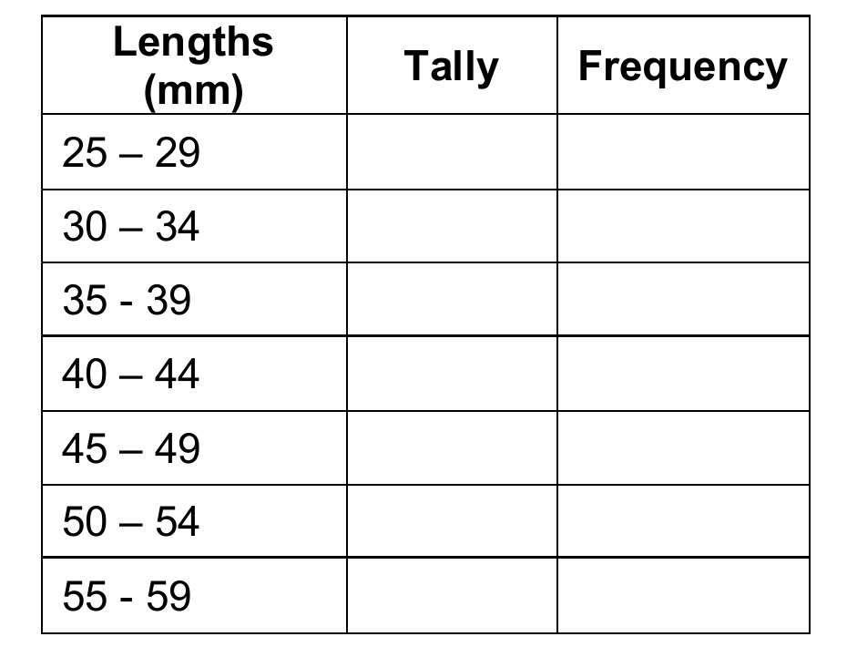
Lengths Tally Frequency
(mm)
25 - 29
30 - 34
35 - 39
40 - 44
45 - 49
50 - 54
55 - 59
E.g. -2 A cleaner of a small office spent GH₵120 of his salary on food; GH₵80 on rent; GH₵40 on clothing, GH₵110 on transport and saved GH₵50. Organise the data and draw (i) a bar chart and (b) a pie chart to represent the data.
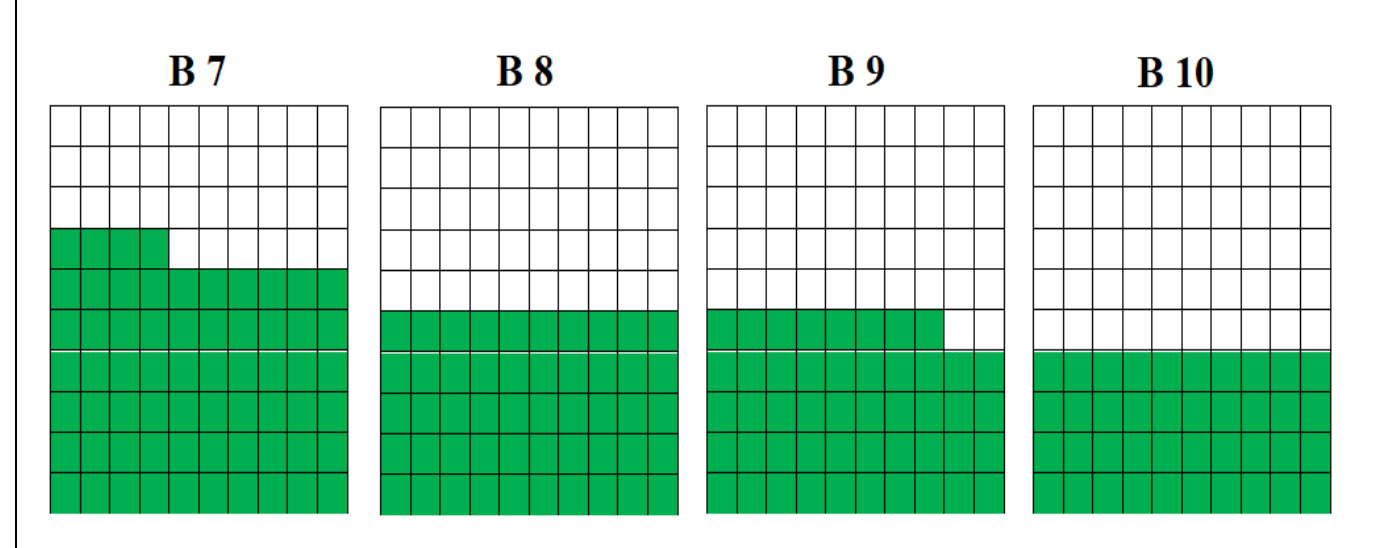
E.g. -3 - The waffle chart (i.e. a 10 X 10 cell grid in which each cell represents a percentage point summing up to total 100%) shows that the average score obtained by B7 learners in a mathematics test conducted, is 64%.
i. Read and record the average scores obtained by B8, B9 and B10.
ii. In a mathematics quiz Cordei scored 75%, Kofi scored 80%, Maama scored 35%, Kpakpo scored 70% and Adjoa scored 50%. Draw a waffle chart to represent the data.
E.g. 4 Make a stem and leaf plot (a stem-and-leaf display or stem-and-leaf plot is a method for presenting quantitative data in a graphical format to assist in visualizing the shape of a distribution and giving a great idea about the distribution of the data.)
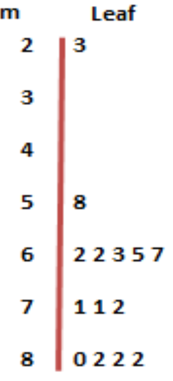
i. The data below are scores for 14 B8 learners in a test graded out of a maximum of 100. Make a stem and leaf plot to represent the data. (Note that though there are no scores for 30s and 40s, 0s should not be put against stem 3 and stem 4.those spaces must be left blank. However, 0 should be put against 8 for 80)
ii. From the plot, what can we say about the performance of the 14 B8 learners? Where:
stem leaf
2 3 23
7 112 71, 71,72
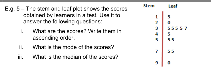
E.g. 5 - The stem and leaf plot shows the scores obtained by learners in a test. Use it to answer the following questions:
i. What are the scores? Write them in ascending order.
ii. What is the mode of the scores?
iii. What is the median of the scores?