JHS1 Mathematics · Term 3, Week 10
Data
Full lesson notes coming
Notes for this lesson are being prepared. The curriculum details below are complete and ready to use for your planning.
Curriculum details
- Strand
- Handling Data (Strand 4)
- Sub-strand
- Data (4.1)
- Content standard
- B7.4.1.1 - Select, justify, and use appropriate methods to collect data (quantitative and qualitative), display and analyse the data (grouped/ungrouped) presented in frequency tables, line graphs, pie graphs, bar graphs or pictographs and use these to solve and/or pose problems.
- Indicator
- B7.4.1.1.3 - Organise and present data from a survey into a table and/or chart, and analyse it to solve and/or pose problems.
- Suggested placement
-
Term 3, Week 10
(Week 34 of the year)
Our suggestion, laid out in curriculum order across three terms of twelve weeks. NaCCA does not fix the week, so follow your school's scheme of learning.
- Curriculum reference
-
Mathematics, Common Core Programme (JHS1-JHS3), 2023, p. 79
Transcribed from the official NaCCA publication. Check this page against the source.
Exemplars (from the NaCCA curriculum)
E.g. 1. Use tallies to organise into a frequency table marks obtained in a mathematics test by students in a class.
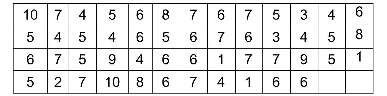
10 7 4 5 6 8 7 6 7 5 3 4 6
5 4 5 4 6 5 6 7 6 3 4 5 8
6 7 5 9 4 6 6 1 7 7 9 5 1
5 2 7 10 8 6 7 4 1 6 6
i. Complete the frequency table below for the data recorded in the mathematics test.
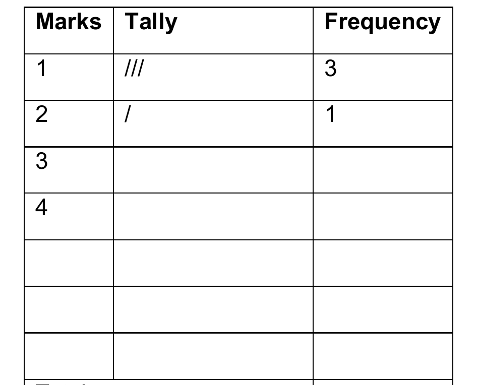
Marks Tally Frequency i. Draw a bar graph to illustrate the data in the
1 /// 3 frequency table.
2 / 1 ii. Write your conclusion about the students' scores in the
3 test and/or pose questions
4 on the graph. Total
E.g. 2 Use tallies to organise into a frequency table, the data below which was obtained by a group of learners for the number of people living in households around their houses.
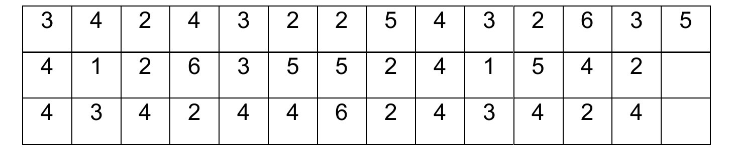
3 4 2 4 3 2 2 5 4 3 2 6 3 5
4 1 2 6 3 5 5 2 4 1 5 4 2
4 3 4 2 4 4 6 2 4 3 4 2 4
i. Complete the frequency table below for the data recorded from the survey of people living in households around their houses. No./ Tally Frequency Angle of sector
Household 1 // 2 2 × 360 = 18°
40
2 //// //// 10 3 //// // 7 4 //// //// 13 ///
5 //// 5 6 /// 3
ii. Draw a pie chart to illustrate the data in the frequency table (i.e. in
E.g. 1 above).
iii. Write your conclusion about the number of people living in the households and/or pose questions on the pie chart.
E.g. 3. Draw a graph or chart for data organised in a frequency table and use it to answer and/or pose questions. For instance,
i. The table below shows how Fakor spends his day. Complete the blanks in the table with information on how you spend your day. Draw a double bar graph to compare how you spend your day with Fakor.

Activity School Sleeping Homework Eating Other No. of hours 8 8 3 1 4 No. of hours
ii. The table below shows the amount of rainfall recorded in millimetres per month in the two towns in Ghana. Draw a double bar chart to represent the data, write your conclusion and/or pose questions based on the chart.

Jan Feb Mar Apr May Jun Jul Aug Sep Oct Nov Dec
Kumasi 5 10 15 20 50 45 55 35 40 50 35 10 Oda 3 10 13 25 40 50 60 50 40 45 35 8