B6 Mathematics · Term 3, Week 6
Data Collection, Organization, Presentation, Interpretation and Analysis
Lesson notes
Learning Objectives
Indicator: B6.4.1.1.1 - Draw a line graph by determining the common attributes (title, axes and intervals) and draw the graph for a given table of values
By the end of the lesson, learners can:
- Identify the three common attributes of a line graph (title, axes, and intervals) when given a table of values.
- Determine suitable intervals for the vertical and horizontal axes based on the range of data in a given table.
- Plot points from a table of values correctly on a graph grid.
- Join plotted points with straight line segments to complete a line graph.
- Draw a complete line graph with a title and labelled axes for a given table of values.
Sign in with your phone number to read the full note and download the GES plan - free.
Sign in with phone numberCurriculum details
- Strand
- Data (Strand 4)
- Sub-strand
- Data Collection, Organization, Presentation, Interpretation and Analysis (4.1)
- Content standard
- B6.4.1.1 - Create, label, and interpret line graphs to draw conclusions.
- Indicator
- B6.4.1.1.1 - Draw a line graph by determining the common attributes (title, axes and intervals) and draw the graph for a given table of values
- Suggested placement
-
Term 3, Week 6
(Week 30 of the year)
Our suggestion, laid out in curriculum order across three terms of twelve weeks. NaCCA does not fix the week, so follow your school's scheme of learning.
- Source document note
-
The official curriculum document has a fault in this entry, so the curriculum text above is transcribed exactly as printed:
- exemplars - p.151
- Curriculum reference
-
Mathematics Curriculum for Primary Schools (Basic 4-6), 2019, p. 151
Transcribed from the official NaCCA publication. Check this page against the source.
Exemplars (from the NaCCA curriculum)
E.g. 1. Give learners the data presented in tables and ask them to determine the common attributes (title, axes and intervals) and draw a line graph. Let them understand line graphs are used when we want to show how something changes over time in relation to something else
E.g. 2. Ask learners to draw a line graph by determining the common attributes (title, axes and intervals) and completing the drawing with title and labelled axes for the data below on how temperature of water increases with time when it is heated.
E.g. 3. Ask learners to study the line graph and answer questions based on them. For instance, after what time will the water temperature reach 70 o C? What is the water temperature after 5 minutes?
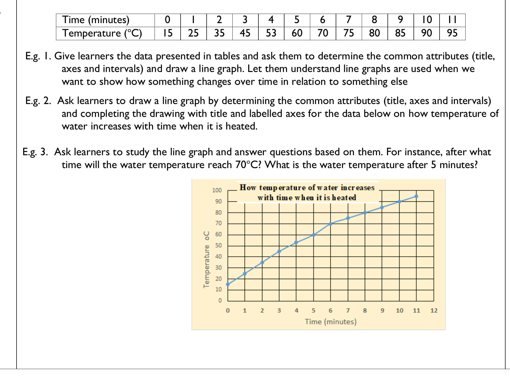
The Time / Temperature table is printed above E.g. 1 and its cells interleave with the indicator heading in the text layer; the figure shows the table and the line graph drawn from it. Superscripts print as separate characters, so "70 o C" means 70 degrees Celsius.