SHS3 Additional Mathematics · Semester 2, Week 11
Organising and Representing and Interpreting Data
Full lesson notes coming
Notes for this lesson are being prepared. The curriculum details below are complete and ready to use for your planning.
Curriculum details
- Strand
- Handling Data (Strand 4)
- Sub-strand
- Organising and Representing and Interpreting Data (4.1)
- Content standard
- 3.4.1.CS.1 - Demonstrate understanding of the nature and strength of relationship between two given variables. 3.4.1.LO.1 Describe the nature and strength of relationship between two given variables using scatter diagram and correlation coefficient. 3.4.1.LO.2 Model and solve problems using regression analysis.
- Indicator
- 3.4.1.LI.3 - Analyse and describe visual data in a scatter plot by interpreting the relationship between given bivariate data sets.
- Suggested placement
-
Semester 2, Week 11
(Week 31 of the year)
Our suggestion, laid out in curriculum order across three terms of twelve weeks. NaCCA does not fix the week, so follow your school's scheme of learning.
- Source document note
-
The official curriculum document has a fault in this entry, so the curriculum text above is transcribed exactly as printed:
- exemplars - p.542: a stacked fraction, matrix, vector or other two-dimensional construct is flattened by the text layer; all visible parts require comparison with the rendered page
- Curriculum reference
- NaCCA curriculum document, p. 541
Exemplars (from the NaCCA curriculum)
Talk for Learning, Think-pair-share, Experiential Learning; and Group Work/Collaborative Learning.
Learning Experience: Learners in groups analyse the data in scatter plot
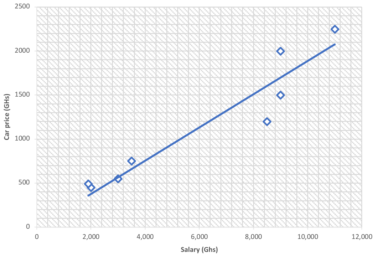
Activity 1: Analysis of bivariate data Learners in groups collect on two related variables (E.g. price of goods and quantities of goods, hours students spend studying and their test scores) and construct a scatter plot to illustrate the relationship between the variables.
Activity 2: Kinds of relationships between two variables Learners in groups discuss how to describe the scatter plot to reflect the relationship between the data and to ascertain whether the relationship is linear or not. Learners in groups make generalisation of the relationship between data on a scatter diagram. The relationship between the data can be positive linear, negative linear, non-linear and no association.
 2500
2000
1500 Car price (GHs)
1000
500
0 0 2,000 4,000 6,000 8,000 10,000 12,000 Salary (Ghs)
Scatter diagram showing positive linear relationship between salary earned by government workers in Ghana and the price of car they own. That is as the salary increases there is likelihood to buy expensive car.
Teaching and Learning Resources:
- ICT tools
- Calculators
- SHS curriculum
Assessment (3.4.1.AS.3). The document marks these depth-of-knowledge levels for this indicator: Level 3 Strategic reasoning.