SHS1 Additional Mathematics · Semester 2, Week 14
Organising, Representing and Interpreting Data
Lesson notes
Learning Objectives
Indicator: 1.4.1.LI.4
By the end of the lesson, learners can:
- Construct bar charts, pie charts and line graphs by hand from ungrouped data presented in frequency tables.
- Use a spreadsheet (such as Microsoft Excel) to generate bar charts, pie charts and line graphs from a given data set.
- Compare two or more graphical representations of the same data and justify, with reasons, which representation is more suitable for a given situation.
- Interpret information read from bar charts, pie charts and line graphs in simple language.
- Evaluate a given graphical representation and explain why it is or is not appropriate for the data being presented, using strategic reasoning.
Sign in with your phone number to read the full note and download the GES plan - free.
Sign in with phone numberCurriculum details
- Strand
- Handling Data (Strand 4)
- Sub-strand
- Organising, Representing and Interpreting Data (4.1)
- Content standard
- 1.4.1.CS.1 - Investigate techniques for collecting data and determine measures of central tendency and dispersion. 1.4.1.LO.1 Collect quantitative and qualitative data, and organise and present data using graphs. 1.4.1.LO.2 Calculate the measures of central tendencies, and measures of dispersion and use simple language to interpret the results.
- Indicator
- 1.4.1.LI.4 - Present data using appropriate graphs by hand and/or by technology and justify why a particular representation is more suitable than others for a given situation.
- Suggested placement
-
Semester 2, Week 14
(Week 34 of the year)
Our suggestion, laid out in curriculum order across three terms of twelve weeks. NaCCA does not fix the week, so follow your school's scheme of learning.
- Source document note
-
The official curriculum document has a fault in this entry, so the curriculum text above is transcribed exactly as printed:
- exemplars - p.221: adjacent duplicated CambriaMath characters were collapsed, but this PDF also maps some equation glyphs to the wrong letter or operator; verify every mathematical expression in this row against the rendered page
- exemplars - p.222: a stacked fraction, matrix, vector or other two-dimensional construct is flattened by the text layer; all visible parts require comparison with the rendered page
- Curriculum reference
- NaCCA curriculum document, p. 221
Exemplars (from the NaCCA curriculum)
Group discussions, Talk for Learning, experiential learning, building on what others say.
Learning Experience: Learners in mixed-ability groups discuss how to represent data.
Activity 1:
- Learners review various ways of representing data in statistics and solve practical examples.
- Learners in groups represent a given data using pie charts, bar charts, line graphs, etc. Each group uses a different graph or chart to represent data and explain it to the class.
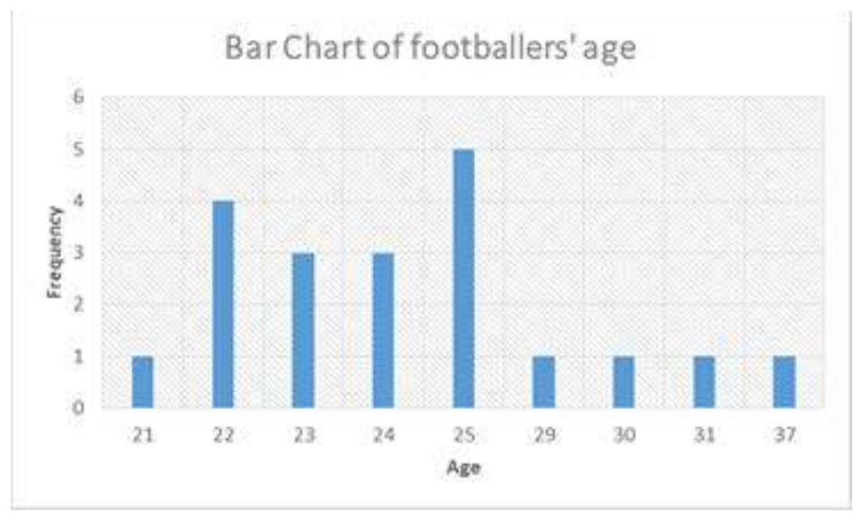
Example 1: The ages of some randomly selected football players are as follows 24,23,25,23,30,24,37,25,23, 22,25,22,31,29,22,25,21,25,24,24,22. Represent this information on a graph or chart.
Solution: Frequency Table
Age Tally Frequency 21 / 1 22 //// 4 23 /// 3 24 /// 3 25 //// 5 29 / 1 30 / 1 31 / 1 37 / 1 ∑𝑓 = 20
Bar Chart
- Other groups represent data using a pie chart and line chart.
- Learners discuss which graph/chart is more appropriate for the representation of data.
- Learners discover that:
- Bar charts are used to show numbers that are independent of each other. For example, ages of footballers, preference for a particular food.
- Pie Charts are used to show how a whole is divided into different parts. For example, how a budget is spent on items in a home within a month.
- Line graphs are used to show trends over time between numbers that are connected. For example, temperature in each month of the year.
Activity 2: Learners in groups explore how to input and analyse data using software such as Excel or any other spreadsheet programme or software.
Teaching and Learning Resources:
- SHS curriculum
- Research journals
- Internet or e-books
- Real-life examples
- Software (Excel, SPSS)
Assessment (1.4.1.AS.4). The document marks these depth-of-knowledge levels for this indicator: Level 3 Strategic reasoning.