SHS2 Mathematics · Semester 2, Week 14
Statistical Reasoning and Its Application in Real Life
Lesson notes
Learning Objectives
Indicator: 2.4.1.LI.1 - Organise and present data (grouped/ungrouped) by means of the ogive, waffle diagrams, box and whisker plots, etc., including generating 3D graphs and solving and/or posing problems.
By the end of the lesson, learners can:
- Construct a cumulative frequency table from grouped data and plot both “less than” and “greater than” ogives on graph paper.
- Interpret an ogive to read the median, quartiles and total frequency directly from the graph.
- Construct a waffle diagram by converting data percentages into a 10 by 10 grid of squares, one square per 1%.
- Draw a box and whisker plot from a given data set by calculating the five-number summary (minimum, lower quartile, median, upper quartile, maximum).
- Interpret box and whisker plots by stating the range, interquartile range and median, and use this information to compare two data sets presented in real-life contexts.
Sign in with your phone number to read the full note and download the GES plan - free.
Sign in with phone numberCurriculum details
- Strand
- Making Sense of and Using Data (Strand 4)
- Sub-strand
- Statistical Reasoning and Its Application in Real Life (4.1)
- Content standard
- 2.4.1.CS.2 - Demonstrate an understanding of data presentations and analysis for grouped and ungrouped data and describe the relationship between the measures of dispersion in data displays. 2.4.1.LO.2 Construct and interpret a variety of data presentation methods, including cumulative frequency curves (Ogive), waffle diagrams, etc. and describe the relationship between the measures of dispersion in data displays to solve and/or pose problems.
- Indicator
- 2.4.1.LI.1 - Organise and present data (grouped/ungrouped) by means of the ogive, waffle diagrams, box and whisker plots, etc., including generating 3D graphs and solving and/or posing problems.
- Suggested placement
-
Semester 2, Week 14
(Week 34 of the year)
Our suggestion, laid out in curriculum order across three terms of twelve weeks. NaCCA does not fix the week, so follow your school's scheme of learning.
- Source document note
-
The official curriculum document has a fault in this entry, so the curriculum text above is transcribed exactly as printed:
- exemplars - p.275: the equation text on this page is set in a CambriaMath subset whose /ToUnicode map doubles every letter and gets many of them wrong, and the glyph ids could not be lined up with the extraction to repair it, so any italic variable here may be doubled or be the wrong letter; read the page
- exemplars - p.275: this exemplar sets a two-dimensional construct - a stacked fraction, an index or a column vector - which the text layer flattens into separate lines, so the parts are present but their vertical arrangement is lost; read the page
- Curriculum reference
- NaCCA curriculum document, p. 275
Exemplars (from the NaCCA curriculum)
Collaborative learning: In small groups, Organise a given data using a frequency curve (ogive) and interpret the graph. Use appropriate technology tools such as Microsoft Excel if available. Encourage learners to be fair and impartial towards other learners and help them to acknowledge that there is reward in being truthful and honest citizenship.
Example 1: Draw an ogive for the following distribution. Class

 0 - 20 - 40 - 60 - 80 - Interval 20 40 60 80 100 Frequency 4 6 5 3 2
Solution Class 0 - 20 - 40 - 60 - 80 - 100 Interval 20 40 60 80 Frequency 4 6 5 3 2 Cumulative 4 10 15 18 20 Frequency (4+6) (4+6 (4+6 (4+6 +5) +5+3) +5+3+2)
Now, plot the points (20, 4), (40, 10), (60, 15), (80, 18) and (100, 20) following steps 3 and 4, and join the points following steps 5 and 6. We get the following ogive.
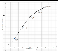
Scale: On the x-axis, 1 cm = width of interval. On the y-axis, 2 mm = cumulative frequency 1.
Group Work/Collaborative Learning: Using think-pair-share activities, learners discuss and make presentations on the types of ogives ("less than" and "greater/more than" ogives).
Lesser Than Cumulative Frequency Lesser than cumulative frequency is obtained by adding successively the frequencies of all the previous classes, including the class against which it is written. The cumulate starts from the lowest to the highest size.
Greater/more Than Cumulative Frequency Greater than cumulative frequency is obtained by finding the cumulative total of frequencies starting from the highest to the lowest class.
Example: Graph the two ogives for the following frequency distribution of the weekly wages of the given number of workers at Serene Hotel. Hence, find the median.
Weekly No. of wages workers 0-20 4 20-40 5 40-60 6 60-80 3
Solution Weekly No. of C.F. (Less C.F. (More wages workers than) than) 0-20 4 4 18 (total) 20-40 5 9 (4 + 5) 14 (18 - 4) 40-60 6 15 (9 + 6) 9 (14 - 5) 60-80 3 18 (15 + 3) 3 (9 - 6)
For plotting less than type curve, points (20,4), (40,9), (60,15), and (80,18) are plotted on the graph, and these are joined by freehand to obtain the less than ogive. For plotting greater than type curve, points (0,18), (20,14), (40,9), and (60,3) are plotted on the graph, and these are joined by freehand to obtain the greater than type ogive.
The less than and greater than ogives shown in the graph below.
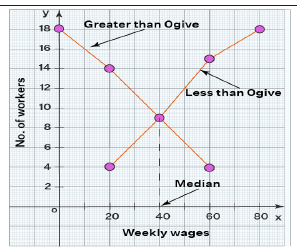
The median: A perpendicular line on the x-axis is drawn from the point of intersection of these curves. This perpendicular line meets the x-axis at a certain point. This determines the median. Here, the median is 40.
Experiential Learning: In small groups, organise a given data using a waffle diagram. Encourage learners to use the appropriate IT tools in designing waffle charts.
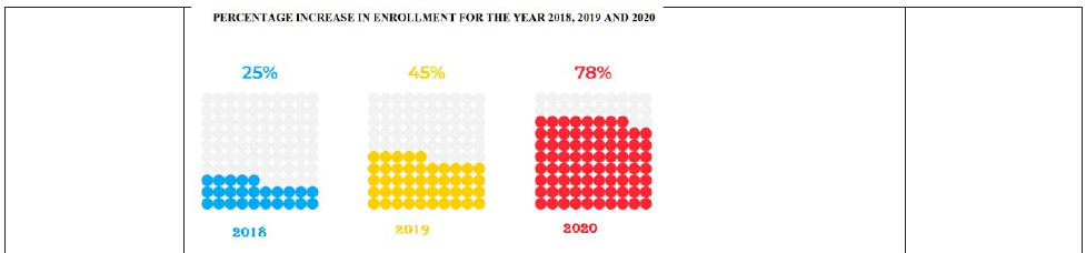
Example: The data below shows the percentage increase in enrollment in a Senior High School in Salaga over a period of three years. Represent the data using a waffle graph.
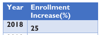
Year Enrollment Increase(%) 2018 25 2019 45

 2020 78
Solution
Think-pair-share: Discuss and make a presentation on the features box plot. Encourage learners to use the appropriate IT tools in designing box plots.
Example: A box and whisker plot (or box plot) is a graph that displays the data distribution by using five numbers. Those five numbers are the minimum, first (lower) quartile, median, third (upper) quartile and maximum.
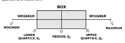
In a box and whisker plot:
- The left and right sides of the box are the lower and upper quartiles. The box covers the interquartile interval, where 50% of the data is found.
- The vertical line that splits the box in two is the median. Sometimes, the mean is also indicated by a dot or a cross on the box plot.
- The whiskers are the two lines outside the box, which go from the minimum to the lower quartile (the start of the box) and then from the upper quartile (the end of the box) to the maximum.
Experiential Learning: In small groups, Organise a given data using a box and whisker plot and interpret a given box plot. Encourage learners to use the appropriate IT tools in making a presentation on interpreting a box plot.
Example 1: Dziifa threw the dice 20 times and got these results: 6 3 3 6 3 5 6 1 4 6 3 5 5 2 2 2 2 3 2 3 Draw a box plot.
Solution: The first thing we need to do is to order the data from smallest to largest: 1 2 2 2 2 2 3 3 3 3 3 3 4 5 5 5 6 6 6 6 Furthermore, we need to calculate the median. Since the number of data points is even, we have. 𝑥𝑥 10+𝑥𝑥11 3+3 𝑀𝑀𝑀𝑀 = = =3 2 2 After that, we have to calculate the quartiles. 2+2 5+5 The lower quartile is: 𝑄𝑄 1 = = 2, while the upper quartile is : 𝑄𝑄 1 = = 5. 2 2
Now, from the data, the minimum value is 1, and the maximum is 6. The next step is to scale an appropriate axis for the obtained 5 numbers. Then, we need to draw a box from the minimum value 1 to the value 3, which is the median, and put a vertical line through the median. Then, draw the box from the median to the lower and upper quartiles. Furthermore, we have to draw "whiskers". Those are the lines that extend parallel with the scale from the bo. In other words, the whisker goes from the lower quartile to the minimum and from the upper quartile to the maximum.
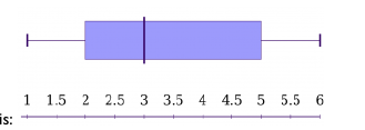
Finally, our box plot is:
Example 2: (Interpreting box and whisker plots) Find the range, the interquartile range and the median of the data in the box plot below.

Solution: Since the minimum value of the given data is 5 and the maximum is 50, the range is R = 50 - 5 = 45. The lower quartile is 15, and the upper quartile is 35. Therefore, the interquartile range is = 35 - 15 = 20. Actually, the interquartile range represents the length of the bo. The median is obviously 25.
Teaching and Learning Resources:
- * Mathematical sets. * Technology tools such as computers, mobile phones, etc. * Computer software applications like GeoGebra * Graph sheets
- computer with data organising software like MS Excel,
- MS PowerPoint, etc.,
- manila cards
- flip charts
- markers
- * colour pens, etc. * Reports from analysed data * Worksheets * Posters * teaching presentations
- enquiry project-template
- A4, A3 papers
Assessment (2.4.1.AS.1). The document marks these depth-of-knowledge levels for this indicator: Level 3 Strategic reasoning; Level 4 Extended critical thinking and reasoning.